
![[Kips+Bay.JPG]](https://blogger.googleusercontent.com/img/b/R29vZ2xl/AVvXsEhVIe_rqMfpLZvg-Q2Bseu5Hd9c5IdSMvysrkWOrEqCMOuRtLodcwKEPqTmxyT1NykwV4aWLEni3IOeUTES6UmnJeCN_Mm0VhC685W2ZlAgUMNiq5qJGGcWqbF7Qb30H5Ydx6hoH73n934/s1600/Kips+Bay.JPG)
By now I'm sure you have heard about Pantone's color pick for 2011.

This is quite an energetic pink!

Color is moving towards fresh, clean hues.
What exactly does that mean?
I discussed clean/dirty color here, if you'd like to read more about it.
I don't ever advise a client to fill their space with the latest and greatest color unless they truly LOVE it.
What happens next year?
If you are using this hue simply to be "on-trend"
are you going to be satisfied when it no longer is the top color?
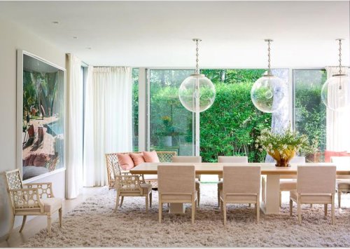
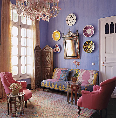
If you have created a fairly neutral shell, or you have used other clean colors that are roughly the same value, you can easily bring in vibrant pink accents.


Domino
I think the we should look at the entire palette from Pantone
to get a clearer sense of what is happening with color.

The silver cloud and silver peony are still holding the grey and blush front.
I wouldn't place Silver peony with any of these other colors
because it simply is not saturated enough to hold it's own.
Russet is signalling an influx of brown - we need something to balance out all this freshness.
In interiors that signals a return to brown woods, rather than all the grey tones we have been seeing.

Domino

The remaining seven hues are all similar in their intensity and clean tones.
You could place any of these in space together and they would work.


Blue Curacao is a softer version of last years turquoise.

I love the regatta blue - it's time to bring blue back from the green side :)

Honeysuckle, which looks so vibrant when examined alone,
fits in to this group without stealing the show.

Pantone's color choices give us a look toward the future,
they interpret our societies emotional climate and the colors reflect it.
It seems right now people are quite ready for a bit of light-hearted fun.
Honeysuckle - will you use it?
til next time..
Pin It Now!
8 comments:
Awesome post. Thanks for breaking it down for us.
I actually love the whole pallete. But I'm not really a neutral gal, so this makes sense for me.
I hope you're having a great weekend!
These will be great in the spring!
I always feel pressure to make my home trendy. Thanks for relieving me of that!
So much beauty in this post!!! I love the hints of pink in the first few photos and the dining room with the black round table is simply GORGEOUS. I would love to have a room decorated like that :)
- the runaway
Lovely! Click ket qua bong da truc tuyen here!
Love <3 lam dep
mon ngon moi ngay
Thanks
gia dinh
cách làm kim chi
I think Honeysuckle is such an uplifting color.
Post a Comment