
Packing up for a rare girls weekend away (first time using that Missoni luggage!), nothing like skiing and celebrating with old fiends, is there? I hope you all have a wonderful few days.. and here's a little pretty for you... x
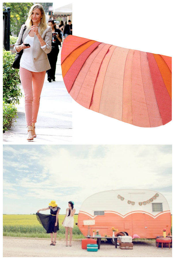
We couldn't talk about orange without moving on to peach, could we? I think pastels are poised for a major comeback (but that's another post:) as we move toward blonde/greyed/limed wood tones. Defining peach is difficult - ask a thousand people to show you the colour peach, and you'll receive a thousand different colours.
But somewhere between orange and white, pink and yellow, lies your perfect peach.

We tend to think as peach a a very soft, airy hue - but as shown on these walls, an entire room of saturated peach can be fairly intense - you really have to love it! If you are going this route, an accent wall or half walls may be the best option. (that bottom room may actually be pink, I'm realizing now, but with the lighting it appears more yellow, so I'm leaving it in, lol)

The more white you add, the more subtle the glow... a very pale peach almost reads as a neutral here.
Below, this is saturated colour well-done - painting a partial wall allows the ceiling to open up for some visual relief.

Placing any peach tone against blue-greens creates a dynamic, complementary scheme.

Here, hits of peach work well with warm-toned neutrals.

If you don't want to make a huge commitment, add just a few pieces....


When you are working with pastels, the concern is that they can look sweet very quickly, and the easiest way to keep your space looking sophisticated is to ground them with greys and blacks.
(I discussed this in my post on mint green and black as well)
The last room, above, accomplishes this, and the last room, below, is my all-time favourite peach look.


Très chic, non? What's your take on peach?
photo links: cameron boa art caravan table clutch chevron bicycle hall view greige living sleeping nook bedroom office vignette bedroom curtains dining room ottoman artwork table turquoise cup moroccan bedroom favourite hair shirt art Pin It Now!

20 comments:
Aha! Just what I have been looking for. I'm planning to paint my room very soon but could not decide on the color. Now I think I have an idea. Thanks! :)
~Lisha
I've actually been tossing a shade of this around for our master...It may have to lean coral (but still soft!) to appease the Mr, but I can't seem to shake the idea. It's only paint, right? :)
Have fun on the trip!
Totally digging peach! I must have added 5 new items to my wardrobe last week in this hue! Love it used in the home as well!
Great eye candy! I also love peacvh paired with blues and greens! Great color combo.! Happy to find your blog and follow! :) Have a fun girl's weekend!
I especially love it with gray/black/navy/forest green. Not an easy colour for me to pull off. In wardrobe and home. For some reason pastels just don't work for me. No matter how much I appreciate them in picture or on others :)
have a safe trip.
Yes, I guess pastels are back. I don´t specially like them in decoration but I agree that toned down with greys and black look pretty good!
Thanks for the tips!
Rats! Wish I'd hung on to some my accesories from way back when my room was peach & tourquoise ! (80's) live & learn
I LOVE the peach and turquoise color combo!! Thanks for the inspiration! xo
MY bedroom in high school had peach carpet, peach floral wallpaper, and peach and mint green custom splatter-paint style shams and bedskirts. I am currently redoing this room for my mom 20 years later, and its funny that those color choices are back!
i always like the look of peach, but i'm a little unsure about it. i think because i cant wear it. weird huh. i think i've just realised i love the colours that i wear, or is it vice versa?!
hope you have a fab girls weekend!!!! xx
Get out of my head!! LOL, I am really liking peach right now. I painted my formal living room SW Faint Coral--a barely there peach. I have paired it with orange/persimmon accents.
Loving coral right now. I think we'll be seeing a lot of tropical & pastel this coming season - so looking forward to it!!!
I'm having fun "flipping" through you're blog pages. These coral walls are great!
I've started up a home decor blog too, I'd love it if you checked it out!
www.ramonarodehome.blogspot.com
I think peach is flattering to wear and pretty in bedrooms. Have a fun trip.
I wouldn't choose peach for my interior but I did get a lot of joy from these pictures! It's such a fresh, happy colour :)
Have a good trip!
I'm loving that peach/aqua bike!!! Have a great ski weekend... you will be SO fabulous with your Missoni luggage!!!
As a Texan, I am totally drawn to peaches (ours are as good as in Georgia!) and the color of a ripe one like in that second to last photo is so beautiful to me. I wish I could get my hands on some stoneware or vases in a shade like that to liven up my dining area for summer!
Love the peach. It reminds of spring and a good time. I guess I should incorporate some peach into my home.
It's a gorgeous hue; beautiful for bringing out artwork. It complements most any work of art.
AAK! Not peach :(
Post a Comment